Gulp, Sass and BrowserSync in practice
- Processes, standards and quality
- Technologies
- Others
If we think about advanced website development, sooner or later we'll deal with JavaScript Task Runners. One of them is Gulp - a library available in NPM, which enables us to significantly automate our work. Gulp facilitates a compilation of Sass or Less files to CSS format; it allows to use Autoprefixer (a tool that will ensure the compatibility of our CSSs with multiple browsers) as well as to watch the progress of our work in many browsers/ devices in real time.
There is much more improvements of the use of JavaScript Runners, but for the purposes of this article I will present Gulp usage, mainly in the context of Sass and BrowserSync.
We start from the basics and for our purpose we install Node and Gulp on developer environment typing:
$ sudo apt-get update
$ sudo apt-get install nodejs
$ sudo apt-get install npm
Windows users can easily download the installer from the https://nodejs.org/en.
Thanks to this we have Node environment on a machine and what is even more important Node Package Manager (npm), which contains 99% of js packages for Node environment we need for our work.
Best practices indicates that shortly after this we should create package.json file (https://docs.npmjs.com/files/package.json), in which we’ll save information regarding packages we are going to use in our project. This file will allow to share our project with others and significantly shorten installation time of a new project instance.
Let’s create it with a command:
$ npm init
Next, we install the first package, i.e. Gulp:
$ npm install –global gulp
$ npm install –-save-dev gulp
Gulp requires global installation in the system, as well as a local one in a given project.
–-Save-dev parameter will enable adding information about this package in package.json file.
If we use git, it is worth adding node_modules catalogue to .gitignore file, where we installed Gulp and where we will put next npm packages.
Having the environment, we can deal with two popular problems:
- DRY CSS
- Automatic update of results of our work on numerous devices
DRY CSS
With the development of our applications and their increasing complexity, we came to a place where our single CSS files contained 10k lines of code and no one was able to tell how many times we repeated the same thing. While the very CSS makes it difficult to organize a modern code, the pre CSS processors such as Less or Sass more than solve this problem.
To effectively manage our code we’ll use CSS processor – Sass.
As modern browsers don’t interpret Sass, we’ll install a package that enables automatic compilation of Sass code to CSS:
$ npm install –-save-dev gulp-sass
We’ll also create the first task in Gulp, saving it in gulpfile.js file:
var gulp = require('gulp');
var sass = require('gulp-sass');

var paths = {
    scss: 'scss/',
    dev: 'dev/'
};

gulp.task('sass', function () {
return gulp.src([
 paths.scss + 'main.scss'
])
 .pipe($.sass({outputStyle: 'compact'}))
 .pipe(gulp.dest(paths.dev));
});
we call it in a console:
$ gulp sass
and we get the following result:
[13:24:12] Using gulpfile c:\xxx\gulpfile.js
[13:24:12] Starting 'sass’…
[13:24:14] Finished 'sass’ after 2.07 s
As presented above, we’ll get information from which file our task was made, then information on calling task, and in the last line, time of its execution.
In the task, we easily refer to the source of SCSS files (this is one of Sass versions) with the use of src method, then we compile the code to CSS (in compact version), finally, using the dest method we indicate where we’ll write down the resulting CSS file.
Additionally, we defined few variables, i.e. paths.scss or paths.dev, which facilitate a fast usage of code in another project.
What does Sass give us?
- The ability to define variables (developed by Style Guide designer and moved to code at the beginning of the project – it guarantees keeping visual coherence in the project).
- The ability to nest one element within another one, including mediaqueries,i.e. cascading of CSS, also at the code level.
- The ability to import files, i.e. the construction of the logical structure of files and directories within the CSS.
- Defining blocks of code (@mixins, @extend) and their re usage, which means DRY CSS, finally.
- The ability to use conditional functionalities and loops.
How can we organise Sass files? I suggest the following solution:
➤ scss
   ➤ base
      __base.scss
      _layout.scss
   ➤ components
      __components.scss
   ➤ bootstrap
      _bootstrap.scss
   ➤ fonts
      __fonts.scss
      _pt-sans.scss
   ➤ helpers
      __helpers.scss
      _mixins.scss
   ➤ pages
      __pages.scss
      _contact.scss
      _404.scss
      _basket.scss
   __shame.scss
   main.scss
It is an easy way to divide our style sheets into catalogues representing our site. Most frequently we will be able to extract a base catalogue with styles of the main layout. The components catalogue will include styles for components (e.g. Bootstrap), fonts catalogue will group fonts used in the project, the helpers one will contain @mixins, @extend definitions and all sorts of auxiliary classes used globally. Finally, we have the pages catalogue, where we can put styles for certain subpages of a service, such as contact, gallery, basket etc.).
In the main catalogue we put _shame.scss file and the latest version of main.scss, from which we’ll import all styles.
A sample main.scss file can look like this:
@import „base/__base”;
@import „components/__components”;
@import „fonts/__fonts”;
@import „helpers/__helpers”;
@import „pages/__pages”;
@import „__shame.scss”;
Individual files e.g. __base.scss, __components.scss, __fonts.scss, __helpers.scss, __pages.scss group all .scss files from a given catalogue so that we could import them to main.scss file.
_shame.scss file plays special part here. Sometimes, with a bigger project, not every person from the team is able to track the development of scss files, and thus optimally add new rules. In such a case, they may be placed in this file (which is loaded as the last one, so the changes will be visible), and the first developer responsible for the CSS is able to implement it to the right place, in his free time. This streamlines the process and allows for quick css throw-ins by everyone working in the project, without affecting the quality of the code. As a rule, when starting the production, this file should be empty.
Automatic update of results of our work on numerous devices
If we already start using Sass, we’ll certainly notice the frequent need to compile the CSS to see the effects of our work. Undoubtedly, it is ineffective and tiring, so it is good to change it.
Watch method from Gulp library is of great help here.
Let’s write a task that monitors changes in our code and performs the tasks in the event of their occurrence:
gulp.task('watch', function() {
    gulp.watch([paths.scss + '**/*.scss'], ['sass']);
});
How does this task work?
In the watch method, in the first parameter we define a range of files to be monitored, and then we give the name of task that will be completed when changes occur in the files.
Let’s do it:
$ gulp watch
In return we get information about the successful completion of this task, but it will continue to work:
[13:31:02] Using gulpfile c:\xxx\gulpfile.js
[13:31:02] Starting 'watch’…
[13:31:02] Finished 'watch’ after 29 ms
after five seconds changes in the code have been implemented, which caused the immediate execution of the sass task:
[13:31:07] Starting 'sass’…
[13:31:08] Finished 'sass’ after 1.35 s
The action of a task can be stopped in the console using a combination of: CTRL +C
BrowserSync
Another improvement that we can implement is the automatic refresh of browser content to see the results of our work on a regular basis. For this purpose we’ll use a great library – BrowserSync. (http://www.browsersync.io) which will refresh the results of our work but also allows much more.
We’ll install a package:
$ npm install –-save-dev browser-sync
Let’s create a new task in the gulpfile.js file:
var browserSync = require('browser-sync’).create();
gulp.task('dev', ['sass'], function() {
   browserSync.init();
    gulp.watch(paths.scss + '**/*.scss', ['sass]);
    gulp.watch(paths.theme + "**/*.php").on('change', browserSync.reload);
});
Because we refer to other tasks, we need to inform them about performing a reload on a browser. Let’s modify the previous task by one line:
gulp.task('sass', function () {
return gulp.src([
 paths.scss + 'main.scss'
])
 .pipe($.sass({outputStyle: 'compact'}))
 .pipe(gulp.dest(paths.dev))
    .pipe(browserSync.stream())
});
now, let’s perform dev task:
$ gulp dev
in return, we get slightly more information:
[13:18:47] Using gulpfile c:\xxx\gulpfile.js
[13:18:47] Starting 'sass’…
[13:18:53] Starting 'dev’…
[13:18:53] Finished 'dev’ after 452 ms
[BS] Proxying: http://xxx.lan
[BS] Access URLs:
————————————-
Local: http://localhost:3000
External: http://10.57.184.53:3000
————————————-
UI: http://localhost:3001
UI External: http://10.57.184.53:3001
————————————-
At start-up, the dev task will perform defined tasks (in this case, only one – sass), then perform the appropriate task – dev – it’ll initialize BrowserSync (http://www.browsersync.io/docs/options/). Next, it will start our site on port :3000, in our default system browser.
The dev task will monitor changes in * .scss and * .php files using a watch method. From that moment any saved changes in our files will trigger certain Gulp tasks and will refresh the browser content.
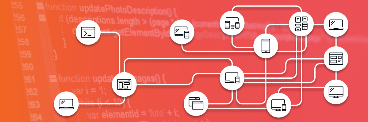
Beside local address, we also got the external one (http://10.57.184.53:3000). We can put it on our mobile devices, for example. If we are working in one network, then any changes in the files will start Gulp tasks and refresh the content of these devices.
However, this is not the end.
We have also received access to excellent GUI, available at port: 3001, in which we will be able to easily manage the BrowserSync functions. Including:
- Clicks – Mirror clicks across devices
- Scroll – Mirror scroll position across devices
- Forms: submit – Form Submissions will be synced
- Forms: inputs – Text inputs (including text-areas) will be synced
- Forms: toggles – Radio + Checkboxes changes will be synced
What is next?
This is just a small introduction to this issue, because Gulp allows much more possibilities, which, however, go much beyond this article. I strongly encourage you to browse the npm repository (https://www.npmjs.com/) to find your own solutions.